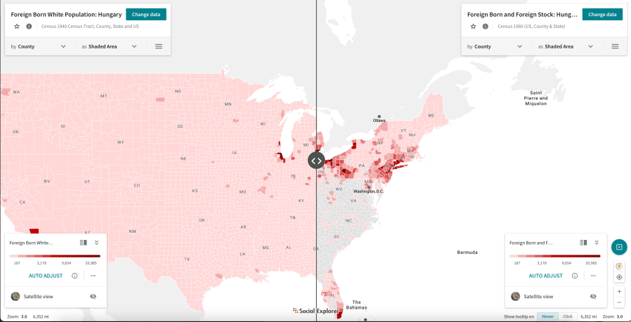
This graphic maps the population of US residents born in Hungarian as reported in the 1940 and 1960 decennial censuses. The maps display the total for each county in the US, with the darker red indicating larger numbers of residents born in Hungary.
This comparison reveals the increased number of Hungarian-born residents after the displacements after World War II, the Communist takeover, and the 1956 uprising.

